Krater has a New Corporate Identity
Krater, the company that has been providing solutions that add value to its customers in the pastry industry for more than 30 years renewed its corporate identity in the scope of an international and global change after the Kerry acquisition.
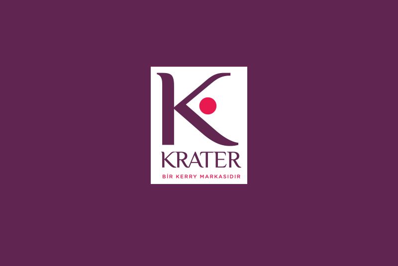
Sorina Caraman, the 20-year designer of the world-renowned design agency CBA-Paris, and her team designed the new logo of Krater. Krater gained a brand new corporate identity with the new font type and colours used in the logo. The letter “K” is prominent in the logo as a stamp of mastery and quality, the “cherry” next to the letter symbolizes the final touch and perfectionism of the master. The cherry that symbolizes the final touch in cake and pastry decoration processes complements the Krater’s corporate identity.
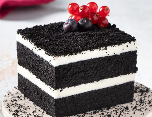
In addition to the change of logo, Krater made a strategic decision, and changed the design of its packaging to gain a more remarkable and distinctive appearance in industry. The logo was given a more readable and eye catching form, and the visuals on the products were renewed. The company that uses the images of the newest products made of Krater’s materials on the packaging materials took a unique professional decision and changed all its packaging materials.
